Superman Returns Banner Tutorial
Jul. 22nd, 2006 08:49 pmI was so pleased with my Superman Returns banner that I decided to make a tutorial for it to show other people how to do similar things, and hopefully have a lot of fun doing it :) So, here goes!
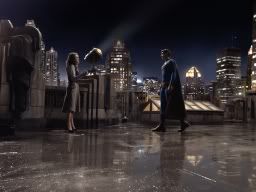
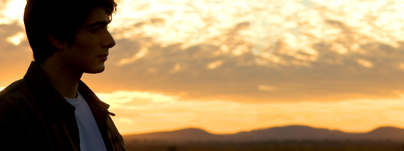
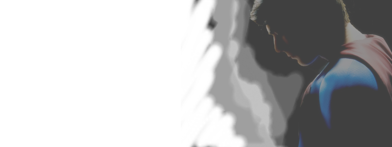
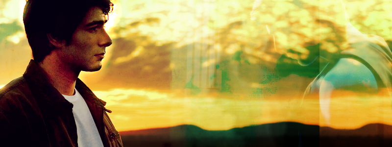
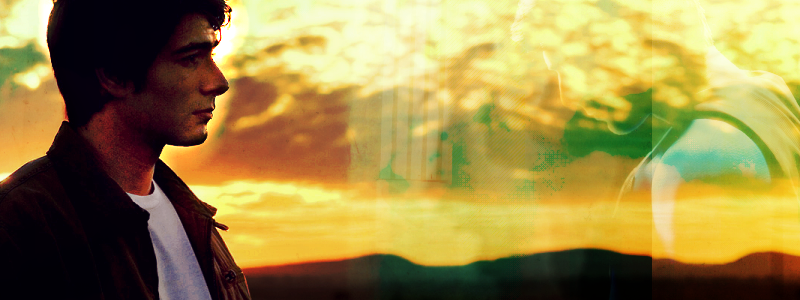
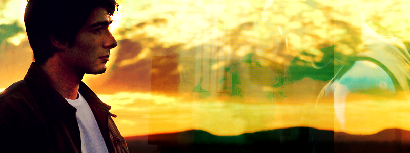
We are making this from these three pictures.
1. Take the landscape picture of Clark and prepare it. I wiped out the text and Superman logo from it (it's one of the promotional desktop wallpapers) using the Clone Brush very carefully to hide it. (I don't have a copy of it before I wiped the logo etc from it.) If you've never used the Clone Brush, its symbol is a little double-brush in PSP7, and you use it by right-clicking the area you want to copy and then running it over the area you want to cover. This allows you to use the area around what you want to conceal to make the image practically seamless without having the ugly text in it. I then sharpened the image using the Unsharp Mask feature, at radius 0.7, strength 100, clipping 0, to sharpen the image without making it too pixellated.
2. Create a new 800x300 canvas (that's width x height, btw), then copy and paste your base image onto it. I use Ctrl+E to select my favourite cut, myself - you basically 'paste as selection' so you can move the image however you like before you set it down. I wanted Clark to be placed far to the left with a lot of free space further to the right, so pasted my base accordingly.
3. The picture is really dark, so duplicate the base and set it to Screen 10% to lighten the scenery. I loved the colours in the background so I didn't want to lighten that too much. Then...
(Step Two result)
4. Duplicate the base again and set to Screen 100%, then 100% erase everything except Clark. It may be easier to select around Clark and then invert the selection and erase everything else. This makes him much brighter so we can see his lovely face, but keeps that lovely background :)
5. Duplicate the base yet again and set to Soft Light 35%.
Your layers should now be, from top to bottom, Soft Light 35%, Screen 100% (Clark only), Screen 10%, Base.
6. Create a new raster layer at the top and fill it with dark blue (I used html code #0D004C) and set to Exclusion, 40%.
(Step Six Result)
7. I then made a Hue/Saturation/Lightness Adjustment layer and set the saturation to -9.
(Step Seven Result)
8. Create a new raster layer and fill with a pale, peachy tan (#E7D0A7) and set it to Soft Light 15%.
(Step 8 Result)
9. Duplicate the tan layer and set that to Burn 25%.
10. I then took my Airbrush tool and, on a new layer and using white, sprayed all over Clark's face, then set the layer to Dodge 38%, which brightens him up some more and puts emphasis on his face rather than on the rest of the image.
11. I then took this texture by![[livejournal.com profile]](https://www.dreamwidth.org/img/external/lj-community.gif) gender and set it to Overlay 56%, which looked quite cool. It added a new layer of colours without overlaying Clark's face.
gender and set it to Overlay 56%, which looked quite cool. It added a new layer of colours without overlaying Clark's face.
12. I then took this texture byiconistas and set it to Overlay 46%, flipped it horizontally and then 70% erased the green patch from Clark's face so that it was coloured but not obscured.
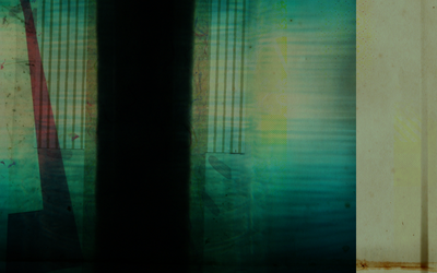
13. This is where we start working with the other pictures as well. Take this image and resize it to about 50%, then flip it horizontally and paste it as a new layer. Set the layer to Soft Light 100%. Then very carefully erase around the edges of Superman from the left, from a strong eraser to a softer one to gradiate it and fade in the edges into the rest of the picture. It's hard to explain the technique that I used - I 100% erased the sharp edges to a softer, curved line to the shape of his shoulder, then used a 50% eraser to get closer, then a 20% to soften what was left. That's the best I can explain it except to show you the resultant layer, which is this.
14. Duplicate the layer you just made with the Superman image and set it to Soft Light 34%, which strengthens the colour. We do this after the erasing so that we don't have to do it again :)
(Step 14 Result)
15. I then made a gradient from the dark blue we used earlier to the pale tan we used earlier, with the blue on the left and the tan on the right, made a new layer, filled it and set the layer to Overlay 63%, to make more of a colour difference between the two ends.
(Step Fifteen Result)
16. I then made another gradient, replacing the blue from the previous one with a bright yellow (#FFFF00), filled a new layer and set it to Dodge 5%. This lightens the image and warms it as well. It's a small difference, but I liked it.
(Step Sixteen Result)
17. Taking this brush by![[livejournal.com profile]](https://www.dreamwidth.org/img/external/lj-userinfo.gif) damnicons, I rotated it 90 degrees to the left, put it on a new layer in black and set that to Burn 14%. I then tilted it 3 degrees to the right, to make it more interesting.
damnicons, I rotated it 90 degrees to the left, put it on a new layer in black and set that to Burn 14%. I then tilted it 3 degrees to the right, to make it more interesting.
(Step Seventeen Result)
18. Duplicate the previous layer with the brush, then erase all but the 'splattery' part at the top - I wanted it to be more prominent than it was.
19. Taking the third picture, I resized it to 50% of its original size, set it to Soft Light 100% and tilted it 3 degrees to the right, then erased all parts that overlapped where the 'burnt' area of the brush showed.
(Step Nineteen Result)
20. I then duplicated the layer with the image of Lois and Superman and set that to Soft Light 45% to strengthen the colours and lines.
21. Using this brush bygender on a new layer in black, I tilted that 3 degrees to the right and set the layer to Burn 32% and duplicated the layer. (You could probably just make one layer at 64%, but this is the way I ended up doing it.) I laid it across Superman's shoulder and across the less interesting, lower part of the picture of Lois and Superman to add detail and interest to that section of the banner, and also to give me a place to put text in.
22. I then wrote 'unrequited' in the font 'jimmy' (which you can get from www.dafont.com) in size 24 and tilted that 3 degrees, then laid it as a new layer above the diagonal lines.
23. After that I added lyrics from Keane's new song 'Is it any wonder?', in jimmy size 12, also tilted 3 degrees, then placed that over the diagonal lines.
24. I cut the Superman logo from another picture and pasted it onto my canvas as a new layer, tilting it three degrees to the left this time and setting it to Soft Light 100%. I put this above Lois and Clark and near the large Clark's head to fill in the large empty space that was there without making it stand out too strongly.
25. Finally, I took this brush by77words and applied it as a new layer, playing with the sizing until I got it the right size to form an interesting border for the banner and set to Screen 100%. I had to expand my canvas by 20 pixels in each direction to allow room for the edge to show properly. I used the Magic Wand tool to select the black area and 50% erased it so that it didn't dull the colours too much, though I liked the way it took the sharpness of the colour from the banner.
And we're done!
We are making this from these three pictures.
1. Take the landscape picture of Clark and prepare it. I wiped out the text and Superman logo from it (it's one of the promotional desktop wallpapers) using the Clone Brush very carefully to hide it. (I don't have a copy of it before I wiped the logo etc from it.) If you've never used the Clone Brush, its symbol is a little double-brush in PSP7, and you use it by right-clicking the area you want to copy and then running it over the area you want to cover. This allows you to use the area around what you want to conceal to make the image practically seamless without having the ugly text in it. I then sharpened the image using the Unsharp Mask feature, at radius 0.7, strength 100, clipping 0, to sharpen the image without making it too pixellated.
2. Create a new 800x300 canvas (that's width x height, btw), then copy and paste your base image onto it. I use Ctrl+E to select my favourite cut, myself - you basically 'paste as selection' so you can move the image however you like before you set it down. I wanted Clark to be placed far to the left with a lot of free space further to the right, so pasted my base accordingly.
3. The picture is really dark, so duplicate the base and set it to Screen 10% to lighten the scenery. I loved the colours in the background so I didn't want to lighten that too much. Then...
(Step Two result)
4. Duplicate the base again and set to Screen 100%, then 100% erase everything except Clark. It may be easier to select around Clark and then invert the selection and erase everything else. This makes him much brighter so we can see his lovely face, but keeps that lovely background :)
5. Duplicate the base yet again and set to Soft Light 35%.
Your layers should now be, from top to bottom, Soft Light 35%, Screen 100% (Clark only), Screen 10%, Base.
6. Create a new raster layer at the top and fill it with dark blue (I used html code #0D004C) and set to Exclusion, 40%.
(Step Six Result)
7. I then made a Hue/Saturation/Lightness Adjustment layer and set the saturation to -9.
(Step Seven Result)
8. Create a new raster layer and fill with a pale, peachy tan (#E7D0A7) and set it to Soft Light 15%.
(Step 8 Result)
9. Duplicate the tan layer and set that to Burn 25%.
10. I then took my Airbrush tool and, on a new layer and using white, sprayed all over Clark's face, then set the layer to Dodge 38%, which brightens him up some more and puts emphasis on his face rather than on the rest of the image.
11. I then took this texture by
12. I then took this texture by
13. This is where we start working with the other pictures as well. Take this image and resize it to about 50%, then flip it horizontally and paste it as a new layer. Set the layer to Soft Light 100%. Then very carefully erase around the edges of Superman from the left, from a strong eraser to a softer one to gradiate it and fade in the edges into the rest of the picture. It's hard to explain the technique that I used - I 100% erased the sharp edges to a softer, curved line to the shape of his shoulder, then used a 50% eraser to get closer, then a 20% to soften what was left. That's the best I can explain it except to show you the resultant layer, which is this.
14. Duplicate the layer you just made with the Superman image and set it to Soft Light 34%, which strengthens the colour. We do this after the erasing so that we don't have to do it again :)
(Step 14 Result)
15. I then made a gradient from the dark blue we used earlier to the pale tan we used earlier, with the blue on the left and the tan on the right, made a new layer, filled it and set the layer to Overlay 63%, to make more of a colour difference between the two ends.
(Step Fifteen Result)
16. I then made another gradient, replacing the blue from the previous one with a bright yellow (#FFFF00), filled a new layer and set it to Dodge 5%. This lightens the image and warms it as well. It's a small difference, but I liked it.
(Step Sixteen Result)
17. Taking this brush by
(Step Seventeen Result)
18. Duplicate the previous layer with the brush, then erase all but the 'splattery' part at the top - I wanted it to be more prominent than it was.
19. Taking the third picture, I resized it to 50% of its original size, set it to Soft Light 100% and tilted it 3 degrees to the right, then erased all parts that overlapped where the 'burnt' area of the brush showed.
(Step Nineteen Result)
20. I then duplicated the layer with the image of Lois and Superman and set that to Soft Light 45% to strengthen the colours and lines.
21. Using this brush by
22. I then wrote 'unrequited' in the font 'jimmy' (which you can get from www.dafont.com) in size 24 and tilted that 3 degrees, then laid it as a new layer above the diagonal lines.
23. After that I added lyrics from Keane's new song 'Is it any wonder?', in jimmy size 12, also tilted 3 degrees, then placed that over the diagonal lines.
24. I cut the Superman logo from another picture and pasted it onto my canvas as a new layer, tilting it three degrees to the left this time and setting it to Soft Light 100%. I put this above Lois and Clark and near the large Clark's head to fill in the large empty space that was there without making it stand out too strongly.
25. Finally, I took this brush by
And we're done!